Sunday 18 March 2012

Final Teaser Trailer

http://youtu.be/gSYH6WfwTyY


This is the final copy of my teaser trailer. I have made a few changes to my trailer, which consist of:


- sound
- shot lengths
- timing's
- new shots
- font


I got the idea of changing things round from audience feedback as well as peer feedback which I found helped a lot to improve my work.

Saturday 10 March 2012

Final Magazine Front Cover - Changes.

I have made some changes to my magazine front cover after receiving feedback from my peers. The following changes have been made:

- The masthead ''Total Film'', has been enlarged as it wasn't like any of the other magazines I had studied.
- I changed the font of the cover line as it looked better when I experimented with this font. It looks more informative and stands out better.
- I put in the conventional bar code and added the date.
- In the 'Plus' section, I added sub headings underneath that were relevant. 

Tuesday 28 February 2012

TimeShift Film Poster.


Here is my final film poster magazine. I created it in 'paint.net' which is an easy enough program to use rather than using a much more complex program that would've taken longer to understand and therefore use. I stuck with the original still of my characters face however used the example of 'Kill List' to influence my poster: http://imgc.allpostersimages.com/images/P-473-488-90/61/6127/RBPF100Z/posters/kill-list.jpg
I used the idea that my main character is faded out into another image which suggests he is still present though vaguely. This is suggestive of time and that he is 'fading' away.

Here are some of the parts in the creation process to my poster: 


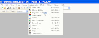
 This is the colour balance I used to change the colour of my fonts. I originally went for black font however, it didnt stand of very well therefore I changed it to white. It is very useful as you can get the exact colours you wish to get. I also used this to make the red 'S' which stands out.
 I had to use 6 layers which basically means I imported 6 items. I they were on the same layer, it would've made editing a lot harder. Also, it allowed me to create that fade with my characters face which I thought is effective.


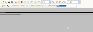
The magic wand was really useful for the times i wanted backgrounds being removed or specific parts removing. I enjoyed using it to perfect certain parts on my text. When I had imported my 'TimeShift' text, it had a white background, I used the magic wand to delete the white background.


This is very self explanatory. This is how I messed with the brightness etc. It was very useful for my characters face as I wanted it dark as if he is a memory and 'fading' away.


Lastly, this is how I created the 'blur' in my main 'S'. I wanted it blurred to create the effect as if it is moving through time, therefore I added the motion blur. I think it turned out well as is looks as though its blurring over the whole font.

Thursday 16 February 2012

Film Director || Xavier Gens

http://en.wikipedia.org/wiki/Xavier_Gens


I have taken a lot of my work from the film director Xavier Gens who was notified for his direction of the film 'Hitman'. It is like my trailer as it is about an assasin who must kill a target however get lost along the way and in doing so falls for a woman and must defend his honour as well as look out for this girl and kill the target. I got my basic storyline structure from this and found it very easy to identify with when thinking of my own trailer.

Wednesday 8 February 2012

Peer Feedback

Main Peer Feedback:
·         More audio needed especially to create suspense. Add some ‘stings’ at certain parts.

·         Use straight cuts instead of fades when panning up main character

·         Titles need to fit the shot frames.

·         Narrative isn’t quite clear, try and make it clearer.

·         Sound needs to be used clearly.

·         Ending needs to be clearer and a little more effective.

·         Make the narrative clearer.
From this in depth feedback, I can see what area’s I need to focus on most. The main worry for me is that my sound is lacking and needs to be chosen very wisely. My peers noted that the lack of sound doesn’t create any atmosphere in my trailer therefore I will aim to sort this factor out. I found the feedback very helpful as it pinpoints exactly where I need to focus on to improve my teaser trailer.
Wednesday 1 February 2012

1st Teaser Trailer Draft.


This is my first draft of my teaser trailer, which I have recorded and within the past two weeks have been editing. Me and my peers have watched my trailer and I have received feedback from them as well as from teacher. I have looked at them at got a basic idea of what would enhance my trailer.

Wednesday 25 January 2012

Film Masthead.

I have decided between these two fonts as they fit my genre of film in the way that they are presented. The first is most likely going to be my main masthead as it reflects 'time' as it looks worn away. The reason I have put the letter 'S' in red is to make it stand out and to reflect the difference between 'time' and 'shift'. Therefore, there is a noticeable difference between the joined words. This was created in 'word processor' and I downloaded the fonts from this website:  http://www.dafont.com/

TIMESHIFT
TIMESHIFT

Saturday 14 January 2012

Ancillary Magazine Basic Mock Up.

Here is my very basic mock up for my film magazine. I have chosen a main image that challenges the normal codes and conventions of film magazines as it fits in with my character in the film and his personality. I am unsure however if it is effective enough and may take a questionnaire to ask/find out what an audience of a film magazine would expect to see as the main image. I have kept the font consistent throughout which is effective as ti doesn't constantly change. 


Monday 9 January 2012

Ancillary Magazine.

I have chosen to go with the 'Total Film' masthead as it aims at a broad audience and is very mainstream. 'Total Film' advertises many mainstream films, one of the latest being 'Inception'. By using 'Total Film' it shows that my film aims to be a mainstream film. I will follow some of the main conventions of the magazine, such as the main image of the the main character in my film etc. I also like the fact that 'Total Film' uses all genre's instead of just one group. This therefore shows it aims at a broad audience.

Thursday 5 January 2012

Ancillary Poster Basic Mock Up.

This is my very basic and minimal ideas for my film poster. I had a play around with effects and colours I could use on the main image of my poster. I tried to make it look worn away and as shown on these print screens.
I used word processor to edit the main image and got the basic ideas from the poster of 'Kill List''. 


Monday 2 January 2012

Drafting Of Ancillary Product.

This is the film poster for 'Kill List'. It is set out in the quad form and has influenced my own film poster for my film 'TimeShift'. My main image is of my main character's eyes with smoke going over his eyes. Although it is very effective, it didn't really relate to the film title 'TimeShift', so therefore by looking at this poster, I like the idea of fading the main image a little and putting something else in the background. This relates to the main idea of time. The use of the fade will be the idea of time and how the two images are seperated by it. My font also reflects the title and mainly the first part of it, 'Time'. It looks worn away and eroded over time reflecting my characters personality and lifestyle as he has eroded over time etc.