
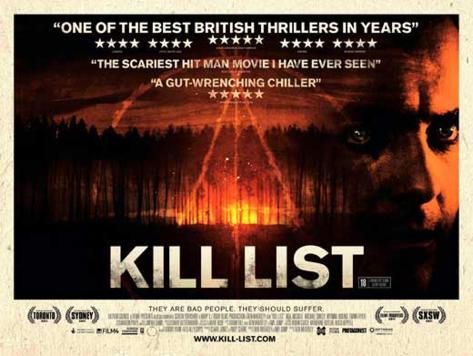
Here is my final film poster magazine. I created it in 'paint.net' which is an easy enough program to use rather than using a much more complex program that would've taken longer to understand and therefore use. I stuck with the original still of my characters face however used the example of 'Kill List' to influence my poster: http://imgc.allpostersimages.com/images/P-473-488-90/61/6127/RBPF100Z/posters/kill-list.jpg
I used the idea that my main character is faded out into another image which suggests he is still present though vaguely. This is suggestive of time and that he is 'fading' away.
Here are some of the parts in the creation process to my poster:

This is the colour balance I used to change the colour of my fonts. I originally went for black font however, it didnt stand of very well therefore I changed it to white. It is very useful as you can get the exact colours you wish to get. I also used this to make the red 'S' which stands out.

 use 6 layers which basically means I imported 6 items. I they were on the same layer, it would've made editing a lot harder. Also, it allowed me to create that fade with my characters face which I thought is effective.
The magic wand was really useful for the times i wanted backgrounds being removed or specific parts removing. I enjoyed using it to perfect certain parts on my text. When I had imported my 'TimeShift' text, it had a white background, I used the magic wand to delete the white background.

This is very self explanatory. This is how I messed with the brightness etc. It was very useful for my characters face as I wanted it dark as if he is a memory and 'fading' away.

Lastly, this is how I created the 'blur' in my main 'S'. I wanted it blurred to create the effect as if it is moving through time, therefore I added the motion blur. I think it turned out well as is looks as though its blurring over the whole font.

