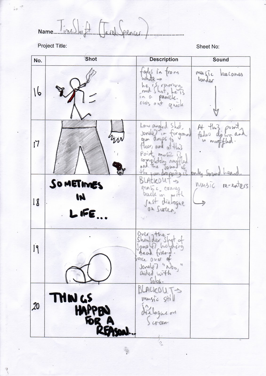
Thursday 29 December 2011

Ancillary Poster Research.


This is taken from the video game 'TimeShift', which is where I got my main ideas from. I like this particular poster for numerous factors it uses. 
Firstly, I want to create an individual logo for my film which will accomodate the film name; 'TimeShift'. The image behind the word reflect movement which is symbolic of time 'shifting' as it were. Secondly to notice is the half of the word looks worn away as if it has deteriorated through time. I would like to include this kind of technique into my poster as it fits in with the name of the film very well.
Firstly, I would like to go for a landscape poster as I can include/focus upon the images rather than all the dialogue. I also like the use of the focus pull to focus on the subject in the front instead the action going on in the back. The way that the background is blurred out creates suggestion into whether it is in the same time period again linking back into the game title. And secondly, I like the fact that the conventional 'hero' is outlined to be the main character and to stand out to the audience to be recognised as their 'hero'.

Friday 23 December 2011

Sound For Trailer.

For my action/thriller, I have decided to create atmosphere in my trailer instead of creating a dark feeling for my audience. Here are a few links from soundcloud.com to create a mysterious tense atmosphere: 

http://soundcloud.com/bubaproducer/atmosphere-volume-1-i-have-a

http://soundcloud.com/bubaproducer/atmosphere-volume-1-i-have-a

http://soundcloud.com/monsieur-scary/the-gate

http://soundcloud.com/scary-font/a-clothesline-wind-2011

Monday 12 December 2011

Empire Magazine Analysis.


Here is the magazine 'Empire' which I have chosen to publish my film 'TimeShift' on to. I have chosen this magazines for many reasons. 
My first reason being is that the title Empire, can be played around with physically so that it looks distorted to fit in with the film genre being advertised. The word Empire itself suggests fame, or something that is well known.
My other reason is from the copies of Empire I have looked at, I have noticed that many of the characters featured on the front cover fit in with my style of film. This is a prime example. This is Captain America and the film is an action which my film intends to be. By using Empire, my film will relate easily to the masthead and will work very well together.
I also like the fact that there is a 'punch line' under the title of the film. This works effectively as it doesn't give away much about the film but allows the reader to suggest things about it.
I have therefore chosen to go with 'Empire' as it fits my film genre in many ways better than the other films magazines. It also makes my film look more mainstream as if a big blockbuster.

Thursday 8 December 2011

Ancillary Poster Analysis


My teaser trailer is a action/thriller and therefore can relate to this film 'In Time'. For my poster, I like the idea of using a gun to symbolise something. Here, the gun is used effectively to suggest that she is going to kill him however the fact that he is holding her may suggest that they have a relationship with each other.

I also like the idea that all the colour looks as though it has been drained away representing the main idea of the film, 'time' which is being drained away from everybody. By not using colours in a magazine front cover or poster, It can suggest a lack of power.

Lastly, I like the tag line ''tomorrow is a luxury you can't afford''. A tag line is good as it gives the film individualism and sum's up the film. It may even create mystery and I will definately think about using one.

Wednesday 7 December 2011

Concrete Target Audience

My film/teaser trailer will be given the certificate of 15. This is due to the violence that may be included in the whole film; the guns, the fighting etc. My trailer however will be targeted at 16 years old's to young adults. It is aimed more at the male gender as they are featured more in my teaser trailer therefore they can easily relate to it. Although it will appeal to a large audience, the trailer in itself appeals for a niche audience who enjoy watching action/thrillers.

Wednesday 30 November 2011

Trailer Ending Ideas.

Here I have made a draft of what I want at the end of my trailer. I am unsure of the music at the moment however I like the way that the 'S' is outlined as it emphasizes the word 'Shift'. 

Sunday 27 November 2011

Research Into Film Magazine.


I have been thinking about which magazine masthead I want to use to accompany my film ''TimeShift'' and have come up with the idea of using ''Empire'' as I think it relates to my film very well. Firstly, a lot of ''Empires'' front covers consist of a ''villain'' which challenges the usual conventions of outlining the hero. I think by using the villain on the front of my magazine, it creates intrigue and question. If the audience believe that the villain has all dominance they are then going to feel un-secure. I also link the way that binary oppositions are used in darth vaders face to reveal something about his character. By using different colour connotations in this specific magazine have given me ideas to incorporate into my own magazine.
I finally, like the fact that he is staring right into the camera breaking the fourth wall making the audience feel again on edge and as if they are involved in the magazine themselves.

Thursday 24 November 2011

Secondary Research


This is the second trailer to the video game, 'Timeshift', which is where I got the idea for the name of my teaser trailer. Although like I mentioned my teaser trailer is not based in the future from this trailer, I like the way that the font is reflective of what is going on in the actual trailer. The font slowly fades in at the same pace as the music why is very effective in building up tension. What also builds tension is the use of rhetorical questions. They involve the audience even more. By intriguing your audience, you keep them entertained thoroughly instead of not giving them any point on interest, 

Thursday 17 November 2011

StoryBoards For Teaser Trailer.


These are my storyboards in order of how they are going to appear. These may not be the exact shots and order however this is a very strong basis for them.

Monday 14 November 2011

Set and Location.

I have decided on my location(s) however images of those is still to be uploaded. I have decided to work around   the Birmingham city centre where the hustle and bustle of people is and I think I could get a really good establishing shot to set my trailer. In most good action films/thriller's I've seen, they usually start off with an establishing shot to entice their audience. I am also setting it around the train station as it links in with my characters feelings of regret and the fact that he wants to get away from it all. I may even think about an establishing shot near the train station to make the audience feel confused to whether or not he is leaving or staying. Lastly, I want to set most of it around myself's or Jono's house as it is around our comforts zones and know a lot of the area therefore, I/we know where certain parts of the trailer will look better than others.

Friday 11 November 2011

Secondary Research.

http://www.imdb.com/video/screenplay/vi1123942681/


For my teaser trailer, I came up with the name 'TimeShift'' as my film relates to going back into time etc, and focuses around time. I like the name as it has two kind of meanings. One, obviously that it is to do with time and secondly the word 'Shift' could be to do with going backwards or forwards in time. On the link is a game which I used to play when I was younger which is nothing like my intended film. This game is set in the future however my film is set in the present and is nothing to do with meddling with time or changing it, just about going back into the past.I like the idea of the game however as it remembers old and new things that have happened in time. You go back and forwards in time which I think is very effective and I could consider using it. I don't think however I want to create a futuristic film as it doesn't fit my target audience and those kind of films do not appeal to me personally.

Tuesday 8 November 2011

Concrete Props/Costume/Actors.

Props
- Guns
- Boxing Gloves
- Weights
- Cigarettes
- Lighter


Actors
- Jono Whitehouse (jono47)


I haven't chosen the actors for my other characters as yet.


Costume
Jono47 is going to be in a black suit all the time however with a dicky bow on. The bow gives his individualism and difference as many other men wear suits with tie's. By giving him this bow, it focuses on him being different physical as well as mentally. The bow could also allow the audience to be suggestive of his character however he may not actually be this way.


When I have decided on a girl to be in my trailer, I think she wear white to connotate purity and angelic features. She can be the complete opposite of Jono47 who is in his black suit/tuxedo which connotes danger. This would make the audience think they have nothing in common physically and hence they have no relationship together however this is how Jono47 appears.

Friday 4 November 2011

Shot & Editing Lists.

In my action/thriller called 'TimeShift', I am aiming my teaser trailer to have a fast pace to it. To do this however, I cannot just make it fast pace as it would have no effect on the audience in the long term therefore, I will build and build up the pace as in a lot of the thrillers/action film trailers iv'e seen/studied they build up the pace to create effect. It keeps the audience intrigued as the pace differentiates. To do this, I will have to use various editing techniques as well as various camera shots.

The shots I will definitely be using are:

Close Up: when action trailers use these, they mostly use them to capture various emotions in the faces of the character to allow the audience to be able to make 'assumptions' but not 'decisions' on them.

Establishing Shot: Sets out where all the action is going to be taking place. Can be really effective as well, depending on the location.

Mid Shot: Is a standard shot. I can use this well to show again the characters emotional OR to show if they are in danger or a danger with eg; weapons in their hands. 

Extreme Close Up: I may consider using one of these but it isn't a definite as I may not sure if I want to give to much away.


Editing

Cut: This is a standard technique used more times than the others. It is a 'realistic' shot to keep all realism in the film. Whereas a fade takes realism away. The quick cut from shot-to-shot keeps you involved and allows you to continue watching.

Fade: I may not used the fade as like I said before, it takes realism out of the film. I may use it to symbolise a flashback but I haven't quite decided. 

Wednesday 2 November 2011

Narrative || Serious Of Events.

Film title: TimeShift/Vindictive


Series Of Events: jono47 as he is known was once a secret agent for M15, a highly trained assassin who was very highly regarded however retired from the job when his best friend 'mikey' was killed infront of him. Although struggling to get away from the past, the same name keeps popping up. 'Marko' the man who killed his friend and colleague is too like jono47 and out of the 'game'. At first, deciding not to look for Marko, jono47 leaves him to his business however when a double murder on the same day of his friends death occurs, jono47 becomes suspicious and confronts Marko reluctantly revealing and rewinding his past. After confronting Marko he finds out a girl close to him is in danger and has only 48 hours to save her. Old enemies re-emergence, its up to jono47 to go with his natural instinct and kill. He must relive his previous life in order to save the girl he loves before its too late. Save the girl, or gain revenge?

Sunday 30 October 2011

Analysis Of Similar Products || HP Trailer.


Camera Shots/Movement.
In this trailer there are a lot of close ups of particular characters to show their emotional state. As this is the trailer for the final film the intention is most likely to show the transformation from when the first characters were first identified in the Harry Potter films. It is very effective using close ups as they don't allow characters to gain dominance. E.g a close up of a face only shows if they are scared or frightened etc whereas a mid shot would allow you to understand who has all power. By using more close ups, it creates a balance. The audience are unsure who has all the power therefore they will try and find who has all the dominance. The ECU of Harry Potters eyes is really effective as you cannot see anything except you can only assume what he is doing/thinking. 


Sound.
The music is very influential in this trailer. The sound flows with every change of show to create the sense of forboding. It is very dramatic and slow to build some tension however when the shots begin coming in faster and quicker the speed of the music changes too. The music is parellel meaning it fits in with what is going on in the film world. The music speeds up when all the action begins to occur.


Text/Dialogue.
The text used is the same used throughout the whole Harry Potter saga's. The text is dark connotating death or danger. Furthermore, when the text is produced on the screen, it comes at the audience as if they must read it. By making it come at them, they feel more involvement in the trailer. The thunder and lighting is a common convention of horror films therefore again the sense of danger is outlined again.

Similar Products || Film Magazine.

Straight away from the pose of Wolverine, you can tell he is positioned in this way to appear dominant towards the audience. Firstly, he is wearing a vest to show his physical power. His muscles are outlined make him appear 'macho' and to follow the conventions of a 'hero'. Similar to the 'Harry Potter' magazine, the colour blue is used to connotate calmness in his character - another convention of the 'typical hero'.

On the other hand, his character isn't looking at the camera giving a sense of rebellion which again with the audiences own knowledge of this character they would understand he sometimes rebellious. His strength and dominance is further outlined with his metal claws which are out giving one the assumption that he is about to fight.

His top is notably white assuming that he is angelic or a ''good guy''. By making him look ready to fight and giving him some conventions of a ''bad guy'', the white top challenges the usual conventions of a ''hero''.
If I was to make a magazine then I may not challenge conventions as I haven't got as much authority or knowledge/understanding as the real magazine makers. 

Similar Products || Film Magazine.

What is really effective about this magazine poster is the contrast between light and dark colours whereas the 'Joker' one was based more around colours themselves. Binary oppositions are very effective here to show the two sides of harry potter as again, the audience should already be able to identify his character. The black represents the evil in him, e.g voldemort - the dark side and the white/purity represents his natural side where he is the 'hero'. Notice that the white over shines the black as his character is the hero and always will be.

Also what is effective about this magazine is the fact that he is staring right at the camera to give him more control and power. He looks 'fearless' giving him dominance. The crack in his glasses makes him look serious as if he is ready to fight. His eyes are blue connotating calmness. This may reflect his manner in that as a hero he has to appear calm in all situations. 

On the hand it may be suggestive that he is weak as he has blood ridden stains upon his face. He may have been seriously hurt questioning whether or not her really is the hero.

Similar Products || Film Magazine.

On the cover of this 'Empire' magazine 'Joker' the notorious villain off 'Batman' is posing for the camera. Ths first thing to be pointed out is his facial features which are really full of anger towards whoever is looking upon the image. His smile is outlined by the colour red, connotating either danger or passion however most likely danger as the audience are familiar with his character. His eyes are also outshone by the black eye liner he is wearing. This takes away the audiences security as they cannot see his faces which somewhat shadows his intentions.
As mentioned the colours are really significant in this magazine. The sheer amount of colours mixed up creates great confusion of his character as people cannot gain the understanding of his emotional state. This reflects his physcotic state as an unpredictable character.
Also worth pointing out is the text used. The text 'Joker' is in green to emphasise the connotation of sickness or envy. As the audience know, his character is envious of 'Batman' and is always wanting to kill him. Furthermore, the colour links itself with the colours 'The Joker' is wearing. The font is unpredictable and very un-formal as if 'jokey' just like the 'Jokers' mannerism. 
To conclude from this poster, I can see that the magazine makers have used 'Joker' knowing that their audience already have a deep understanding of his character. By making him look mad and using colours like red and green to back this up, they can relate much easier to him although they already have some of thei own knowledge to back this up.

Monday 24 October 2011

Set/Props/Costume/Actors || Concrete Idea.

Set
I haven't decided on a definite location for my trailer but as I am doing an action I was thinking about doing it inside of a gym where the fighting/action can take place. I also thought about setting it in a industrial warehouse as there is a lot of mystery surrounding these locations. I do not want my setting to be to far from where I live as it would be difficult for me and the actors in my film to get to.


Props
Boxing gloves, punchbag, gym equipment, hand gun.


Costume
My main character is either going to be a fighter or a hitman therefore I haven't given him a definite costume. I quite like the idea of a plain black suit or if he were a fighter then a gym attire such as joggers and a jumper. I may use certain colours in their costumes to signify something in particular but I haven't decided exactly yet.


Thursday 20 October 2011

Initial Ideas Of My Trailer.

  • Genre: Martial Arts Action. Include a fair bit of fighting etc.

  • Storyline: I thought of having a antagonist in my film who is a 'Hero' in himself however the actions he does aren't good. This would be good as it could slightly challenge some of the original conventions of Action films.

  • Camera Shots and Angles: I would like to include a lot of mid-shots to show all the 'Action' as this will entice the audience more and maybe a few shots that aren't used very regularly to symbolise something.

  • Editing: Action films are notorious for there fast paced editing to create suspense. It would be really effective in a trailer as they don't give a lot away to the audience. I will probably use just cuts as they are a quick way to change shot because if I used a fade it wouldn't have much effect and would be really slow to change creating the opposite feeling I want to create.
I would like to involve a fair amount of Martial arts into my film as I enjoy watching these films. I watch them a lot and I can appreciate the kind of things the audience want to see in it. Based on my research I have a very good idea of what I want to include in my trailer/

Audience Secondary Research.

General Conventions.
  • a Hero is thrust into a series of challenges where they have physical bouts to save people or 'save the day' as it were. Usually consisting of fights, car chases or big climax's. A character struggling in against incredible odds, such as a life threatening situation or being chased by the conventional 'Villian'.
  • Is it higlhly suggested that 'The Villian' is accustomed to be in all Action films as they create that 'Good and Bad' atomosphere. For example, 'The Dark Knight', 'Never Back Down' and 'Cape Fear'.
  • Most commonly but not always 'The Villian' who has had all power throughout the film loses it at the end to 'The Hero'. this is usually decided by a big fighting scene or a large explosion in which 'The Hero' walks out untouched or bruised and battered but very much alive.
  • Fast paced editing, explosions, weapons/guns, authorty being restored.

About 'Action' Genre.
  • Movie studios have have given 'Action' movies critical praise in that although action films have traditionally been aimed at male audiences from the early teens to the mid-30s, many action filmmakers from the 1990s and 2000s added female heroines in response to the expanding social conceptions of gender, taking away the hint of favouritism/sexism.
  • Action Sub Genre's: Action Comedy; this invloves a bit a comedy/humor. Began more popular in the 80s when actors such as Eddie Murphy began known. They are most commonly light-hearted and invlove little or no major injuries to the characters in the film. Some comedies may be suggested to be Action Comedies because they have some scenes of action however these are just plainly Comedies. An example of Action Comedies are; 'Midnight Run', 'Beverly Hills Cop'.
  • Die Hard Scenario: Where a film is set in one location. For example on a plane or in a large building. Eg; 'Flightplan' or 'Snakes On A Plane'. Most commonly they are under control of the 'Villians' and the films objective is to 'take the Villians down'. Another example of a Die Hard Scenario is 'Con Air'.
  • Martial Arts: These films contain large amounts of fighting scenes with 'The Hero' most commonly beating 'The Villians' up. By using these kind of films, it usually focuses more on 'The Hero' than other characters. It focuses on their emotions and their development in the film. Most often aswell, the actor who play 'Th Hero' are actually trained fighters in Martial Arts. Eg; Bruce Lee, Steven Seagal and Jackie Chan. If they are not actual trained fighters, they will train beforehand to become that character. This is know as the Stanislavki technique where actors become there given character way before the film is to be directed and produced. Examples of these are; 'Kill Bill', 'Ong Bak' and 'Under Seige'.
  • Sci-fi Action: These are based more around science fiction and are used mainly to outline guns fights or space ships or other sci-fi elements weaved into 'Action' films. Examples are; 'Terminator', 'The Matrix' and 'Transformers'. This would be hard for me to produce as I do have the technology. The audience for this genre is suggested to be older males who are into science fiction. The conventional 'Movie Geek' who collects action figures etc.
Overview.
I think, based on the outcome of my questionnaire I will do an 'Action/Martial Arts' as this really appeals to me and my audience. It would also be easier to make as I have access to all I would need to make this trailer. The audience I have noted prefer it when their favourite Action genres have all the typical conventions so when they come watching it they at least have some understanding of the film. I will have to consider this I dont that I have enough knowledge and experience to challenege the conventions of films.

Wednesday 19 October 2011


Music
First to be noted is the fact that the music is parallel following in tune with the action going on in within the film world. At certain points also, it is clear to see that the music is actual synchronisation with a punch or a elbow focus on the actual impact. By doing this it enables the audience to feel engaged more as they get into the film. This is effective as instead of dialogue, music can make certain points in a trailer stand out. For example, a punch could be outlined by louder music. The music they appears to change into contrapuntal music as it creates meaning in the trailer. The music is more dramatic to effect the audiences emotional state more and try and make them engage more with the audience. It could be suggestive that this music symbolises a change in the film or a main feature to come in the film, therefore always leaving the audience asking more and more questions.


Camera Shots
Unlike 'Hitman' the camera shots at the beginning of this trailer are very short and edited to a very fast past to build up suspense and that action kind of mood. Many people believe fast paced editing is key to an action film as it reflects what is going on in the scene. Most of the shots are mid-shots as they capture the essence of the action going on in the trailer. By allowing the audience to see this, it entices them more into wanting to watch it. Furthermore, when the music changes, so does the shots. Some of them come to close ups and mid-close ups to shot the emotions on the characters to again give hints to certain parts in the trailer. In my trailer, if were to differ between different camera shots and angles, it may gain me more marks and give me a better understanding of camera shots and their effects on the audience.


Text/Dialogue
The text used in this is also reflective of the action going on in the trailer. It is bold and stands out and is simply there to stand out as well as to be read. It flows well with the music and dominates the screen when put there. If text is to be used then is should be used for a purpose. It may be to ask the audience questions or give them knowledge of certain parts in the trailer. I am unsure whether or not to use text as I may not have access to programs to make text as good as this however I shall see when my my trailer is coming into its final stages.

Sunday 16 October 2011

Analysis Of Similar Products ||


Lighting
In this poster, a lot of the lighting is very low key lighting giving the assumption that they are evil or in danger however at a second glance, you can notice that their faces are outlined by high key lighting. This may contradict the low key lighting to suggest that they may not be evil in themselves. White also connotates death or innocence therefore the poster may be foreboding bad things to come. What is very effective however is the fact that the black is over shadowing the whole of the shot. This creates a big sense of mystery and makes the audience feel on edge. Also, in the corner of the shot there is a flame suggestive of hell. It looks as though they are driving into hell or into danger as it were.

Setting/Location
The setting of the poster also creates mystery as it is in a vehicle. In a car it suggests they are running away from someone/something and again incorporates that they may be in some trouble. The car is also a small secluded space making them appear close together suggestive of them being ''Partners in crime''. Thirdly, the car is damaged with bullet wounds on the side making them look as though they have been in a gun fight or again suggestive of them running away from authority. The person driving the car looks like he has more dominance creating the convention of men having more dominance than women.

Costume/Make Up
Firstly the woman is wearing a blue top which is un-buttoned giving away sexual desires. This may suggest a relationship between the two characters sexually making them appear close. Secondly, her top is blue connotating peace or authority. She may be comfortable in this situation or may be the leader of it. On the other hand the man is wearing all black making him appear evil. Pure evil. This may suggest that they not in a relationship as he is completely different to her. Added onto his black clothing, his eyes look black also to make him look as though he has no emotion. All this leads to the assumption that he is the devil or is linked to the devil himself.

Facial Expressions/Body Language
The woman in the shot looks as though she is scared with a hint of happiness or enjoyment at the fact they are driving away. Her body language suggests that she is emitting sexual needs towards the man. Her legs are upwards showing flesh that would give men sexual fulfilment. On the other hand the facial expression of the man is completely different. He looks more angry and related to the film; 'Drive Angry'. His face has focus as if focusing on a goal to aim. On the other hand however he looks emotionless as if phsycho like.

Thursday 13 October 2011

Audience Questionnaire || Results.

1) How old are you?
Again this is a really good result for me as the group 16-18 was chosen the most. I too fit into this category therefore I can relate to my own work easier and ask my fellow peers for advise on what to include in my piece of work.


2) What genre do you prefer?
From this I can notably say that the people I selected for my questionnaire favour Action films is is really good as I want to create an Action teaser trailer.


3) How often do you watch films?
b) Twice a week, this seems to be in the middle of the choices. People appear to watch only a couple of films as anymore would be very time consuming. The
is chart shows that a majority of my audience likes to watch films three times a week which is quite high therefore they will have a reasonable understanding of films.


4) What gender are you?
a) Male b) Female, here I got both choices evenly. There is no distinction between male or female. It would appear sexist to have one out favour the other. My trailer will appeal to both genders as I don't want to discriminate anybody.

5) Why do you prefer your chosen genre?
People mainly said that they liked to be on edge at certain points, especially because they ''liked to be surprised''. Others said that they like a challenge in that they are scared to a huge extent and makes them feel uneasy. I will try and aim to make my audience feel uneasy at a/some certain points in my teaser trailer.

6) What would you want to see in a film teaser trailer?
''Cliffhangers, Climax's, mystery jumpy moments''. All of these all seem to want to make my audience feel away from their comfort zone. By taking away what they know and putting them into something they don't know, the film will dictate how the audience act.

7) What would you want to see on a film trailer?
 ''Pictures, large text, various colours attractive actors/actresses''.

8) Do you read film magazines often?
c)Often, this suggests my audience would be very critical towards my film as they have a deep understanding and have a great knowledge towards films.


- Like explained, these answers were taken and calculated to find out the model number for each question. I can conclude that I want to base my teaser trailer around the Action genre as I have chosen my target audience. I would
 like to include features that I myself would enjoy as I am in the same age range as my target audience therefore I can relate to the factors I incorporate in my work.


Audience Questionnaire || Target Audience.

Circle where appropriate.

1) How old are you?
a) 12-15 b) 16-18 c) 91-21 d) 22+

2) What genre do you prefer?
a) Horror b) Thriller c) Action d) Comedy

3) How often do you watch films?
a) Once a week b) Twice a week c) Three times a week d) More than three times a week

4) What gender are you?
a) Male b) Female

5) Why do you prefer your chosen genre?
..........................................................................................................
..........................................................................................................
..........................................................................................................

6) What would you want to see in a film teaser trailer?
..........................................................................................................
..........................................................................................................
..........................................................................................................

7) What would you want to see on a film trailer?
..........................................................................................................
..........................................................................................................
..........................................................................................................

8) Do you read film magazines often?
a) Yes b) No c) Often d) Not very often

Once I have gotten all of result from this questionnaire, I will get a model answer for each question and come up with a conclusion which may have an effect on my work. Decisions such as my film genre have already been decided however other questions here haven't been chosen.

Wednesday 12 October 2011

Analysis Of Similar Products || Hanna Poster.

This is similar to 'Hitman' as it is the same kind of genre and style in the film. It is full of action and is somewhat a 'role model' for me to base my teaser trailer. This poster uses mise-en scene effectively to give a completely different message.


Lighting
The lighting doesn't seem/appear to be that significant in this poster. Although it seems very bright, it is trying to give that effect of naturalistic lighting without making it seem too bright. 'Hanna' is a free woman who lives out in the wilderness therefore the naturalistic lighting is used to symbolise her character. Like most parts of mise-en-scene, factors that are added are added for effect. The effect of the lighting is to allow the audience to make assumptions on her character or on the film itself. Natural lighting may be effective in my trailer if used correctly. Also, if I can effectively differentiate between high key and low key lighting then I may be able to gain more marks towards my work.


Setting/Location.
Very differently from 'Hitman' there is no hint to where the location of the film is. This is to perhaps create mystery for the audience so that they do not find out the location. It also may be used to build on her hidden identity as we cannot see her face. The close up of her faces ties in with this as the audience really want to know what she looks like however they are being 'teased'. This will be incorporated in my work as I want to 'tease' my audience. By taking away their sense of security in that they would usually know where the location is, they will feel out of their comfort zone.


Costume/Make Up.
The costume used in this is very effective as he symbolises her character. Her clothing is dry and naturalistic as if made from animals fur and woodland features. This allows people to assume what her character is like. It makes her appear more animal like that human and this is also backed up by us not knowing her identity.Furthermore, the colour connotation of green can suggest new life or even nature. This means that she may be, like said before, an animal herself. Her face is very unclean also linking back to her animal appearance. If I wish to create a action film, the costume and make up I use will have to be used to effectively. I will make sure my costume symbolises something about specific character as well as the make up.


Facial Expressions/Body Language
Facial expressions make or break a poster. If you were to have a horror film with someone joking about and smiling, the whole idea of the horror would be broken. Here, 'Hanna's' facial expression or lack of facial expression creates a deeper understanding for her character. As the most of her face is covered her eyes are used to create her expression. She focused as if hunting something with no hint of emotion. She looks like a predator hunting the prey. Added to this, her arms are holding a weapon in front out of focus to make her look like a trained killer who isn't to be messed with. Her eyes are the only part of the frame with colour which are outlined heavily. This may allow the audience to make assumptions to why this is. I think it would be best to involve certain factors linked to facial features into my work as it will engage the audience more and continue making them ask themselves questions to why I have made my work that way.


Thursday 6 October 2011

Analysis Of Similar Products || Hitman Poster.


Here is the poster of the film 'Hitman' and is the first part of the advertisement process for it. 'Hitman' is a action film based around a Bounty Hunter who's trained to kill people. I want my poster to be similar in some aspects of this as all the main concepts of Mise-en-scene are used in this poster to give hints of the film away.

Lighting

Firstly, low key lighting is used very effectively here on 'Hitmans' face to maybe suggestive that he the villain or to symbolise he may have a very negative contribution to the film. On the other hand however, high key lighting is used to outline the woman in the background. She may be considered to be good however this is contradicted with the red dress with the colour connotation of danger or passion. The colours and lighting do not give to much away about each character. They allow the audience to make suggestions however we are unable to get a fix on the characters. Although I may not have access to high key lighting or other aspects of lighting, I can still incorporate a few aspects of lighting, e.g low key lighting, to create a representation of someone or something. In this, the high key lighting is also used to amplify the gun/weapon which is being held. This suggests his character is envolved with weapons and is dangerous or may suggest that it may play a role in the outcome of the film.

Setting/Location

The background image of a city isn't just there for no reason, it is put there for a purpose. It is the place where the film will take place. Secondly, it is really bright and full of life. This links in with the girl as she looks dressed to go out to the town and ready to party. This image may also be where all the main action is to take place. I would also like to incoporate an image in the background of my poster however it may not be as effective as this one. For me to use a background such as this, I need to find a suitable setting for my teaser trailer, such as a town or a place with the right kind of features.

Costume, Hair & Make Up

For a poster, Make Up, Hair and costume are very effective as they can give certain hints away abut the film or characters. Like I touched on, the most obvious use of costume is the woman in her red dress. The red connotates danger in many respects. The dress is very tight and and sexy suggesting passion or love. Her make up also backs this up as she looks all well done up and her hair is short and is also well done. On the other hand, 'Hitman' has a lack of make up to show reflect his personality. A plain personality where his work is the same everyday. This is outline with a very formal dress in a suit in immaculate condition. The killer of his costume is his gloves which are usually associated with killers or criminals. His tie is also red which may link him with the girl in the background maybe hinting they are together or again that he is dangerous or has passion towards the woman. I will use colour connotations in my trailer and poster and they are very effective and are good for trailer as they dont give too much away. I can make a man for example look dangerous and this opens the door for the audience to suggest anything about his character.

Facial Expressions & Body Language

'Hitman' no facial expression however he is armed with a gun. His body language suggests that he is 'born to kill' or well trained with weapons. He looks comfortable in this situation. On the other hand, the womans body language is suggestive that she is sexy. She is posing towards the man maybe trying to show her love and passion towards him. She isn't smiling or not smiling therefore, one can only assume that she is looking for romance. Body language will be key in my poster as I will want to show dominance like 'Hitman' is here to allow my audience to make suggestions and gain a greater knowledge of my film.

Blocking

Like metioned breifly, 'Hitman' is postioned closer to the audience giving him all power and dominance to the woman as she is in the background and looks small. Dominance is key for action films as a hero always established. Thay may not always have that dominance but at some point they wull have it. She is positioned at the back maybe to suggest she is chasing him.


Monday 3 October 2011

Target Audience.

From the beginning I have always wanted my teaser trailer to be an Action or a Thriller however a main factor I need to think about when choosing my genre is my target audience. 

When thinking of a target audience, i need to think about the Demographics:

How old are they?
18+

What’s their gender?
Mostly Male.

Are they married, divorced, single?
Any.

What’s their ethnic and religious background?
Anybody can relate to trailer.

By thinking about these questions I can gain better understanding on the kind of target audience I am pitching my teaser trailer at.
I want my trailer to be aimed at a higher age range as this means I can incorporate more factors for that particular age.

Tuesday 27 September 2011

Analysis Of 'Million Dollar Baby.'

We analysed 'Million Dollar Baby' with the scenes in which 'Maggie' gets knocked out and canalised analysed them in 3 different types of medial ways; 'Sound, Editing and Camera Work'. I analysed 'Sound' and here is what I found:
Punch: It is a diegetic sound and is amplified making a 'swinging' sound. This illustrates the importance of this punch as it is an illegal punch and outlines the seriousness of the situation. The punch moment that changes the whole film.
Lack of/or Minimal Sound: After recieving the blow she falls to the floor in slow motion. The sound is then faded down to again emphasise the punch. The numbing sound also reflects the sound of her becoming absent of hearing after being hit. This technique is very effective and could be used in my own teaser trailer. Movies such as action packed films where there is fighting would be useful to incorporate the fading down of sound. 
Crack Of Neck: The crack of the neck is the 'click' or change of the film. It is amplified to shows the seriousness again and to show how feeble she now is from one action. This is the turning point.
Music(sad): This kicks in when the realisation of the situation. It ties in with the crowds reaction and again would be useful in my piece as I could outline a certain point in my trailer. 
Dialogue: As she is on the ground, the voice of the man is echoed to show her fight in and out of consciousness. It reflects how lifeless she is and is a good method of showing her point-of-view. 
Whimpering: It emphasises that she has no power now. Contrasts with her being all powerful. She has nothing now and is emotionally broken down.


In my opinion, the music kicking in right at the moment is the key part of the sound. It gives mood and emotion and is open to interpretation. This music here in my opinion was used to create sympathy for 'Maggie' and to make us empathise within her character. It also flowed well as the music linked the audience in the film together as they too wept for 'Maggie'. I may include this as it is good for setting moods and can instantly create tension when brought in. 

Sunday 25 September 2011

'Hitman' Trailer Analysis.


This trailer follows the same genre I want to use in my teaser trailer; action. From this trailer I can take away a lot of useful factors that may have an impact on my own piece of work. They are as follows;


- Camera Shots: there is a a lot of cameras obviously used to create a film however, taken from this particular trailer I can see that close ups are used more often. I may therefore choose to add more close ups as they are effective in capturing specific emotions. I also think they are effective in a trailer as they help by not giving too much away to the viewers. 


- Sound: The sound or music used in this trailer is very effective. Although it is contrapuntal, it works well with how the director is trying to put across the film. The music is intellectual as is the idea of the whole film therefore music would also be a big aspect in my trailer. The music I use may not be contrapuntal however, by watching this trailer, I will be able to chose what I want easily.


- Text/Dialogue: I have chosen to use very little text in my trailer as used in this trailer. If i was to use too much dialogue between characters too much would be given away and would the defeat the whole object of the trailer being a 'teaser'. I think having text across the screen to introduce the trailer is effective as is sets the tone of the trailer. For example the text in this trailer is silver however very grim. By having this, it helps the audience get a better understanding of the film.

Thursday 22 September 2011

Over-The-Shoudler Shot.

This shot is influential to my teaser trailer as it is very effective and a easy shot to achieve. Firstly, it is an over the shoulder, mid-shot showing the subject's facial features. Added onto this, his face seems to address the audience directly involving them more and making them feel challenged. The anger in his face is also illustrated in his face with the un-natural lighting which is very effective as it builds a kind of Gothic/tense situation.
I would like to include a shot such as this as it would fit my action/thriller genre very well. Although many other genre's use the over-the-shoulder shot, action films also use this shot to influence particular characters  or scenes. 

Investigation In To Genre

http://www.imdb.com/title/tt0465494/


This is a link to the film ''Hitman'' which is a possible genre I may use as my teaser trailer. ''Hitman'' is a high action packed film which appeals to me highly as this is the kind of trailer I wish to create alongside the conventional close ups, straight cuts and fast paced sound.

Thursday 15 September 2011

Sound.


Diegetic Sound; Sound within the film world. E.g a woman swimming in a swimming pool or a man shouting at someone. Most common one is dialogue.


Non- Diegetic Sound; Sound that is not inside the film world. For example, cello notes/phrase and accompanying orchestra.


Sound Bridge; A sound bridge is when a sound or piece of music(diegetic or non-diegetic) is used to link different scenes or shots in a film.


Internal Diegetic: what we hear from inside the actors heads. Its not in the film world as other people cannot hear it however its not on the exterior of the film world as the main character can hear it. Its simply, in her head.